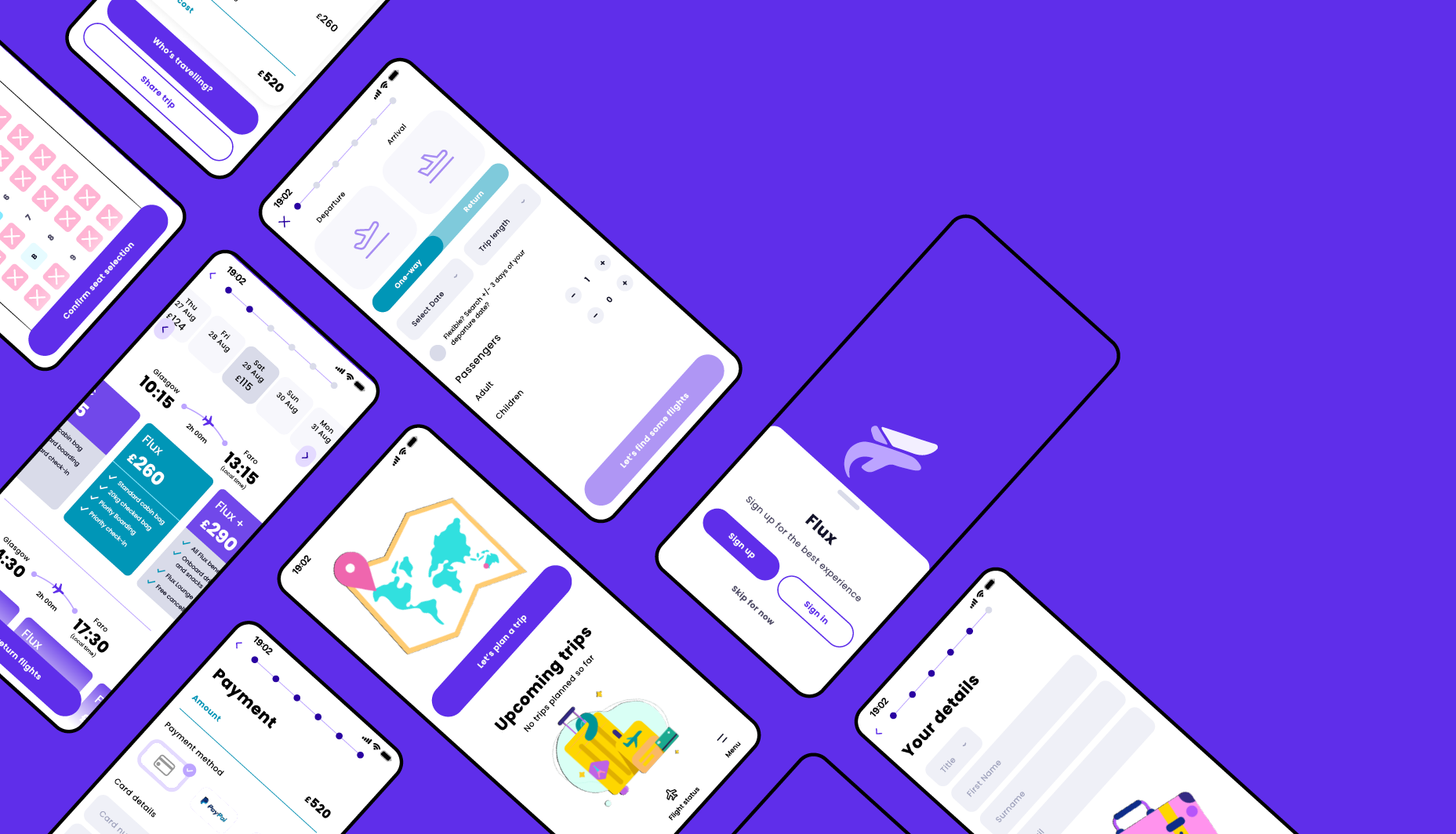
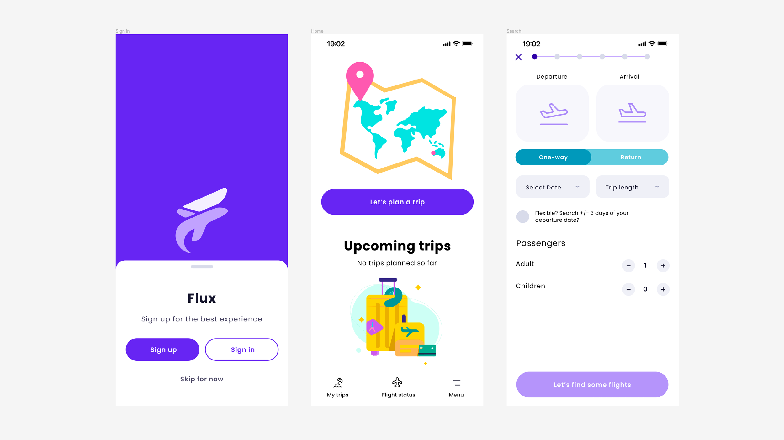
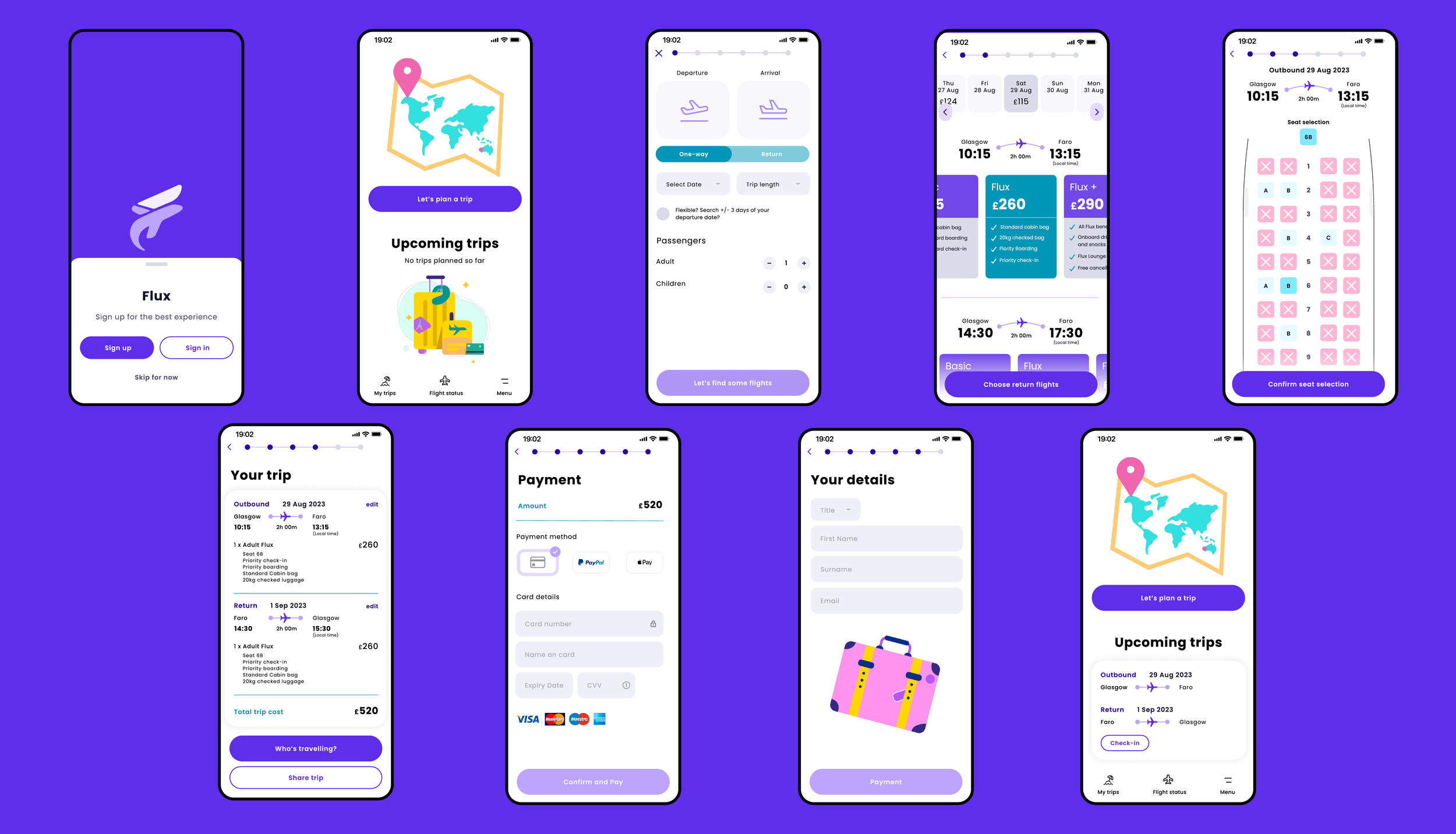
Flux is the name of my project I created while studying at the UX Design Institute.
The goal of this project was to create a native app for a fictional airline. They were looking to create an experience that was easy and intuitive based on an understanding of their potential users. The booking process was the focus of the project — how users search for and book flights.
This project took me through the full UX process, starting with the research phase to gather pain points and see what currently works well. I gathered my research and used analysis methods to identify key areas to focus on and then moved into the concept, design and prototype phase.
The aim of the project was to design a prototype that could be tested by users to allow for design iteration and create a design handoff for developers.
Client
UX Design Institute
Project Type
UX / UI / Product Design
Role
Research / UX / Product Designer
Year
2022–2023
Project Tools
Figma, FigJam, Miro, Survey Monkey, Pen & Paper
Research
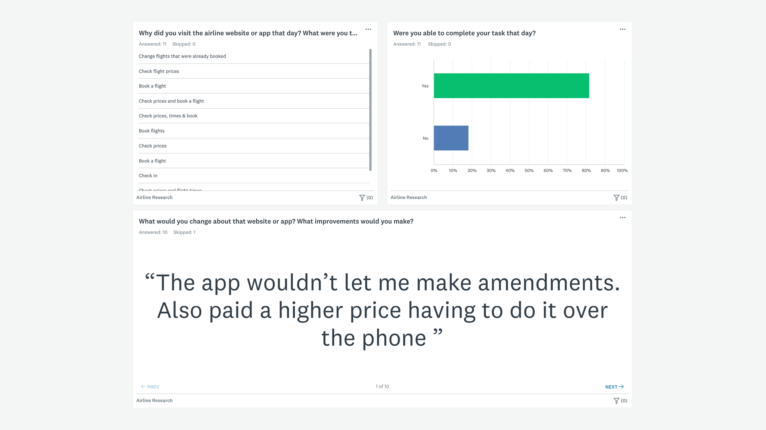
Online surveys
This step allowed me to gain a better understanding of users goals, contexts and behaviours. The survey gave me insights to;
Users goals when booking a flight
What pain points they are experiencing
User suggestions for features
Key findings: Users were frustrated at the difficulty of basic tasks and having to pay to have simple amendments. Users also used apps to check prices, flight times but found it hard to make comparisons fear of driving up prices from repeated searches. Users struggling to use apps and breaks in mental models of how it should work versus how it actually works.
Reflection: In a real world setting, I would aim to gather a lot more responses to gain deeper and richer insights. I relied on my gym community as participants but using a survey company with paid benefits would be the way to gather more responses.
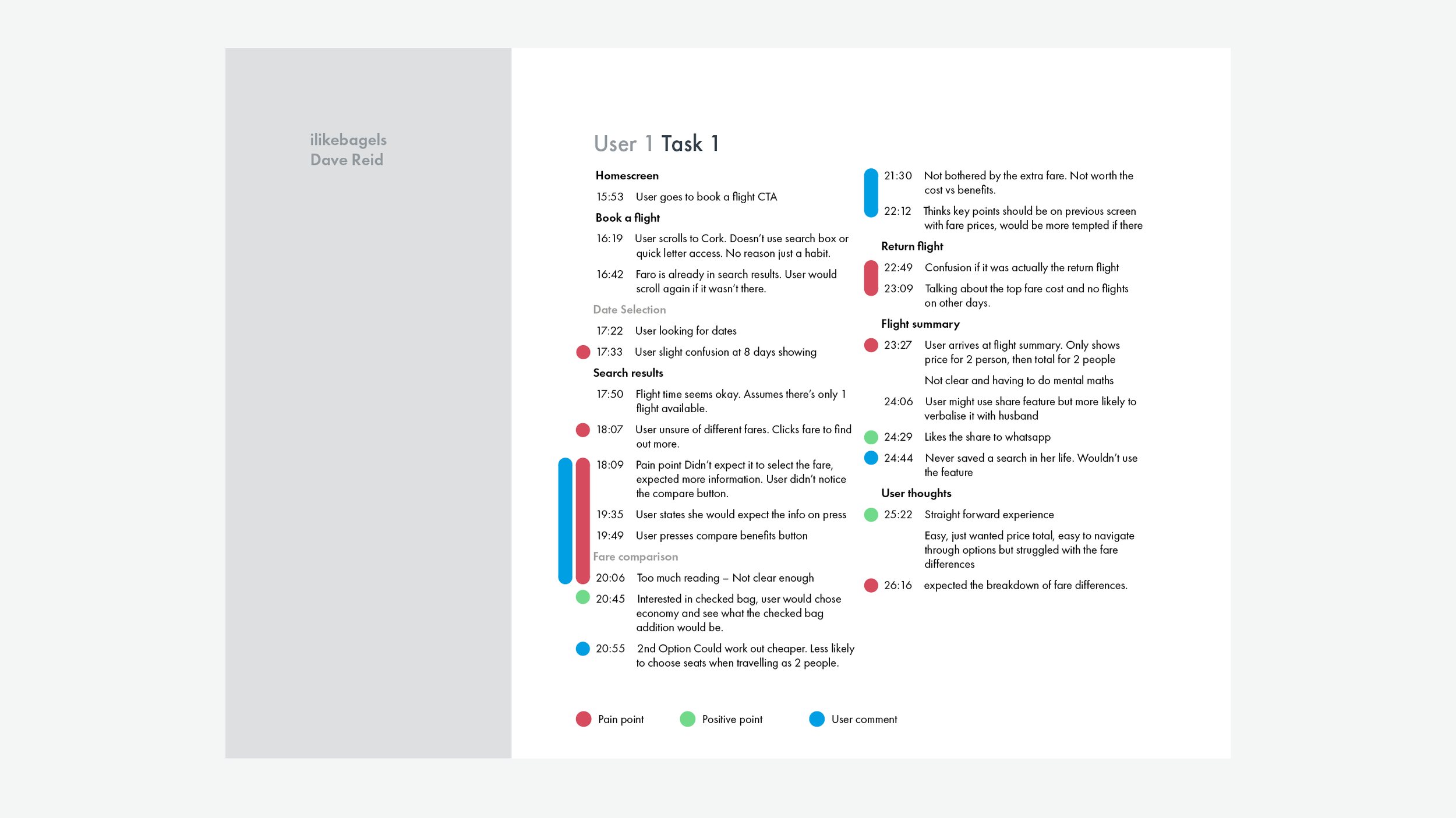
Usability test note taking
As part of the course we were required to learn how to take good quality notes from provided usability tests. We were provided with two recorded studies to take detailed notes focusing on the users: goals, behaviours, context, positive interactions and pain points.
Some key findings: Both users struggled to find far information in app 1, but not in the other. Both users preferred app 1’s date selection method, with clear distinction between outbund and return. Both users failed to notice their trip had stop overs in app 2. This failure lead to both users wishing to look elsewhere for flights. Any stop overs should be clear and prominent to the user as early as possible. Both users had issues finding fare information in app 1, prices and fare information should be easily accessible.
Reflection: This project gave me a better understanding of how to conduct a usability study and allowed me to develop my note taking skills. I gathered some rich insights that I could take forward into the analysis phase of the process.
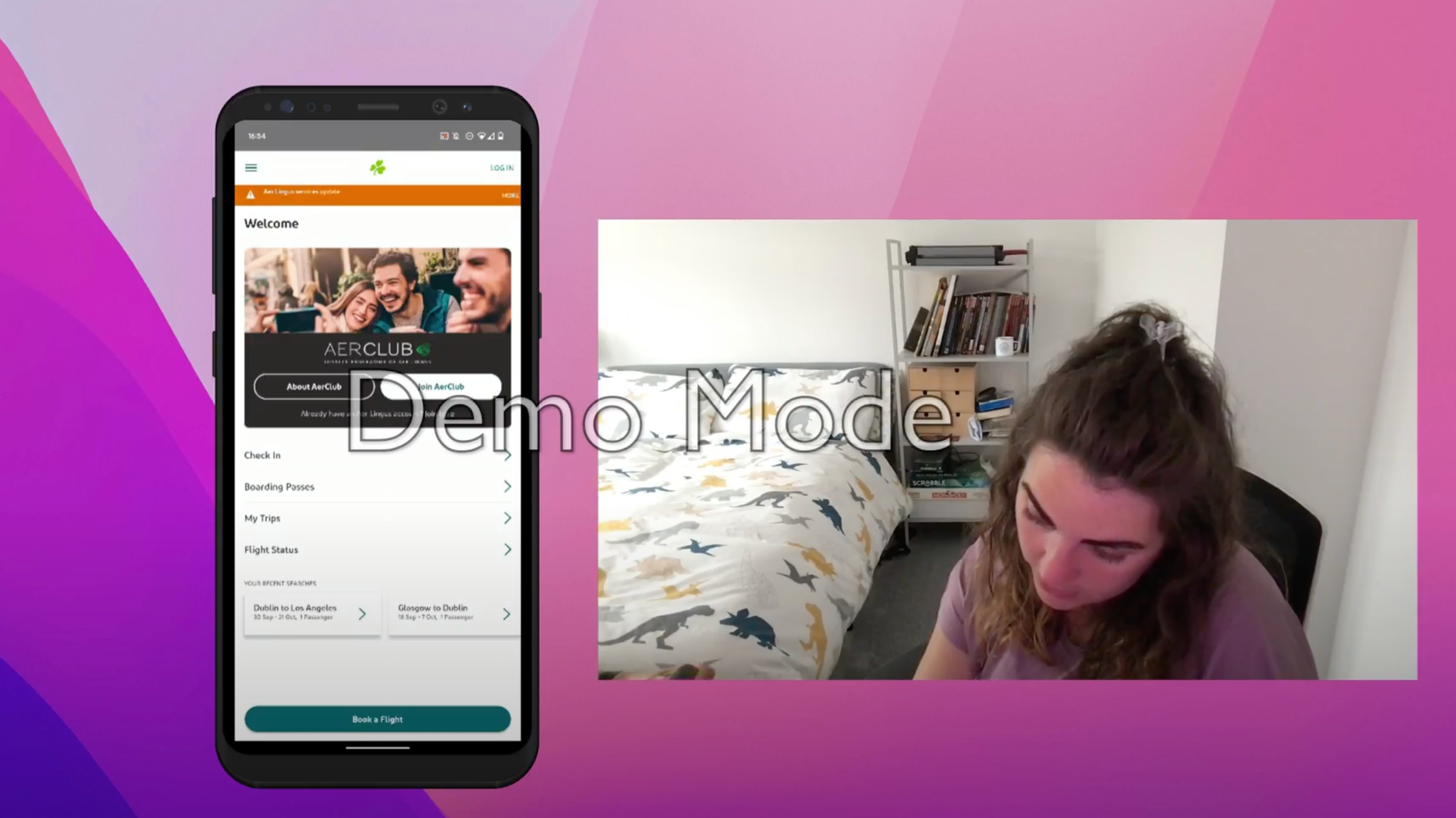
Conduct usability test
I found a suitable candidate to carry out my usability study, a family member who had recently booked flights for a holiday. In preparation, I created an interview script and usability test script to cover all of the areas that were relevant to the project.
Firstly, I started with a in- depth interview to gather insights about the participant’s background and technology usage and about recent travel and booking history to get an understanding of their goals and needs when booking a flight.
For the usability study I used the same two airlines from the studies we were provided during our note taking project, Ryanair and Eurowings.
Analysis
Affinity diagram
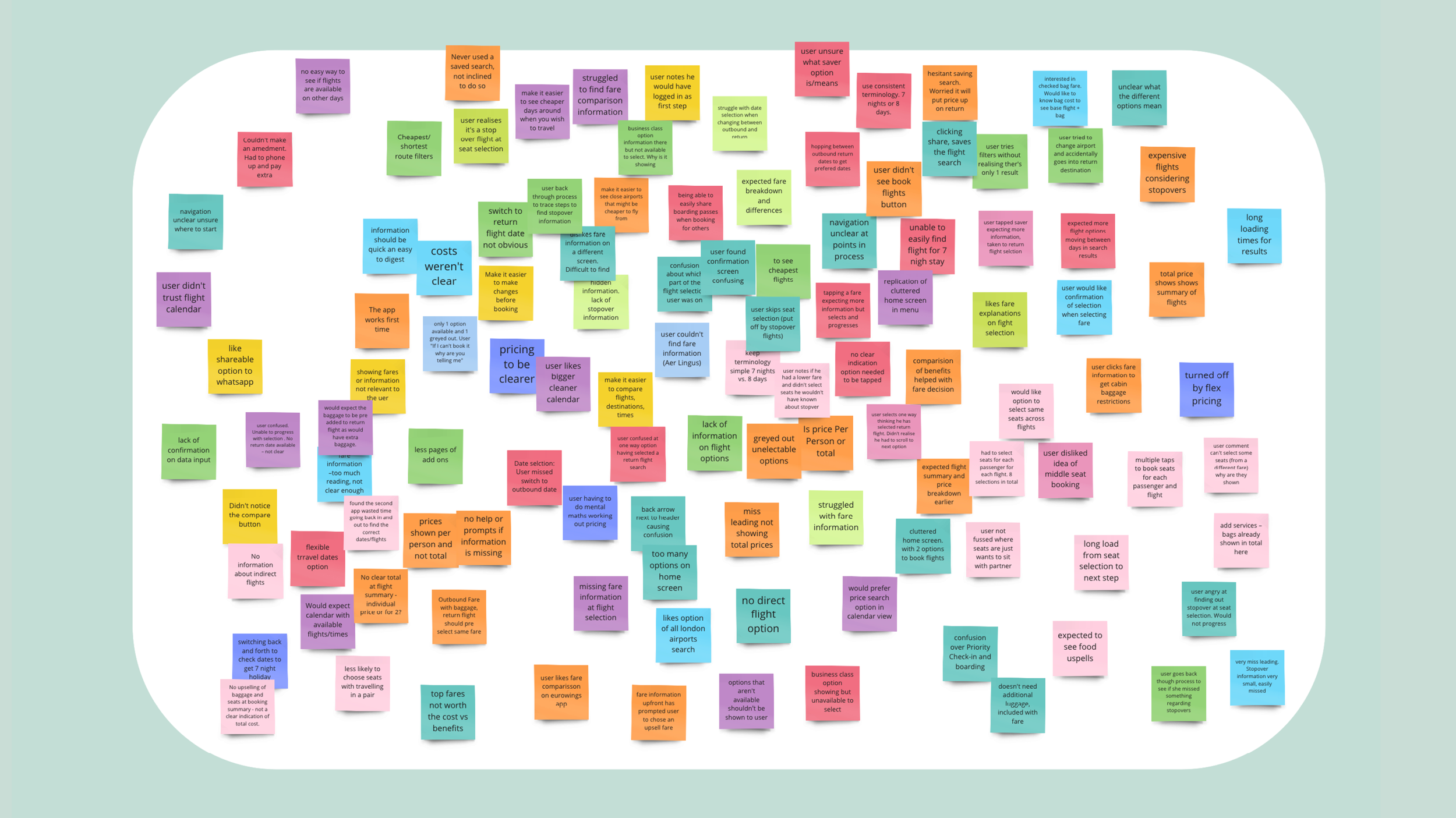
I brought all my research together from the earlier stages to create an affinity diagram. Using this technique allowed me to add structure to the qualitative data collected. I used Miro to allow myself and two others to create single points of data onto sticky notes and from there we organised them into logical groups where we could identify the areas that required improvement.
Customer journey map
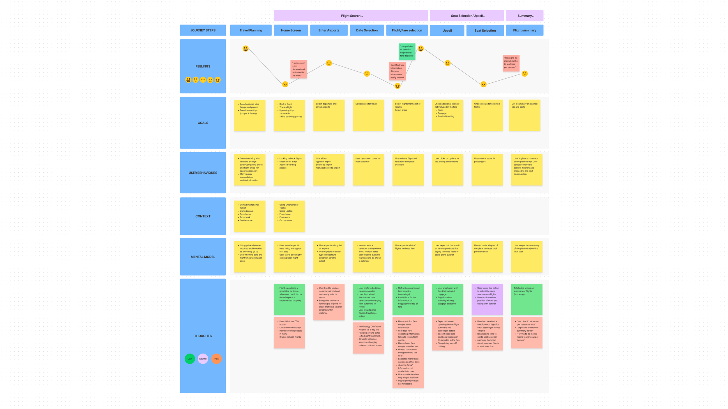
To bring more structure to the insights from the affinity diagram, I created a customer journey map. This involved defining the steps a customer takes from deciding to book a flight all the way through to the summary/payment.
For each stage of the journey I defined the users feelings, goals, behaviours, mental models and context. This allowed me to plot the users overall emotion across the process and highlight areas that needed improvement.
Concept
Flow diagram
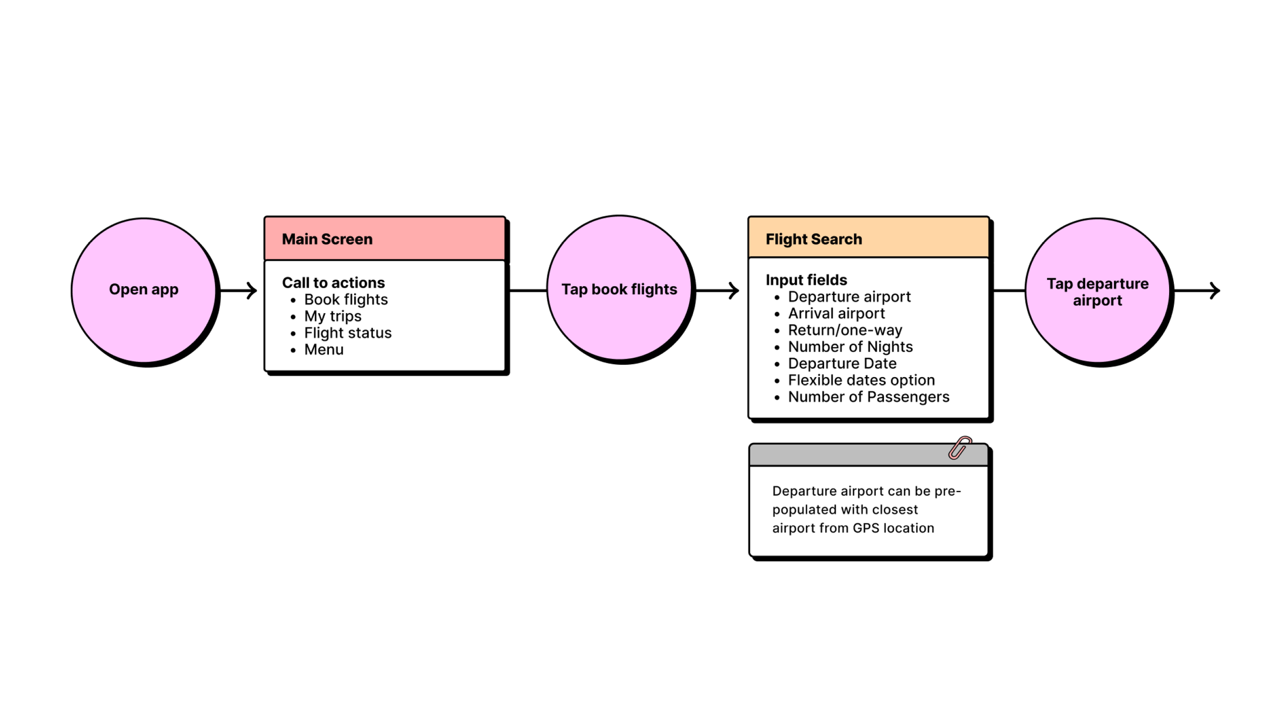
With the insights gathered from the analysis stage, it was time to create the user flow diagram for the booking process. The flow starts when the user opens the app and details every action and screen change across the booking process.
I found that I kept coming back to refine the flow during this phase. It was an essential tool that laid the foundations for the design phase and creating the screens the user would interact with.
Interaction design
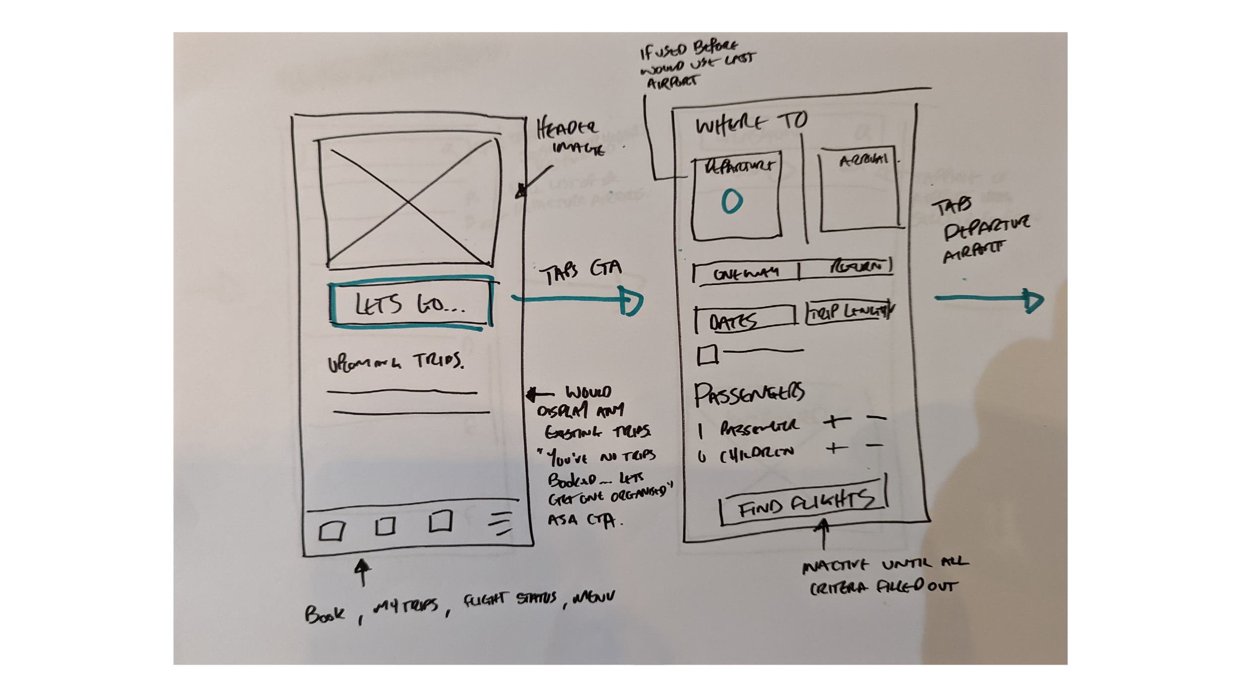
Now that the flow was defined, it was time for pen and paper prototypes. I started designing screens based on the insights I had discovered in the research and analysis phases.
My aim was to sketch rough screens whilst thinking about the users pain points and how to solve them. This took a few rounds of sketching and iterating on ideas as I moved through the flow.
I photographed my full flow which was then used as reference when designing the screens within Figma.
Design
Prototype
Moving into Figma, I started off by creating a series of reusable assets to allow me to design screens more quickly, text styles, buttons, input fields etc. I wanted to create a high fidelity prototype as I have a strong graphic skill set and background and felt it would allow for richer insights when it came to testing.
I found during this process that I had to make changes to the user flow as I started designing which helped improve the overall user experience. I found that I kept coming back and making adjustments and changes over the design phase.
Handoff
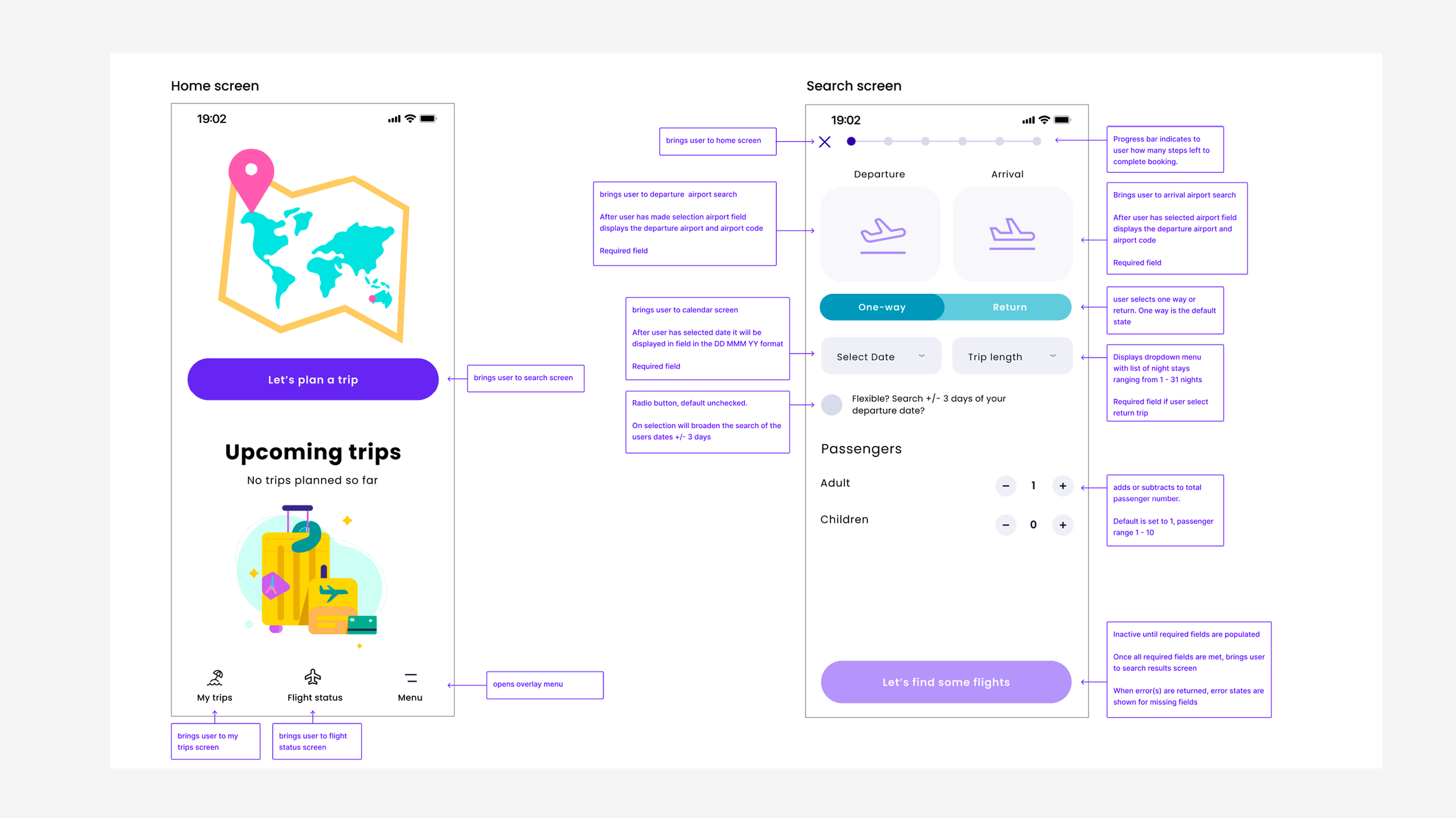
Our final stage was to create detailed handoff annotations that would be given to a developer to build our solution. I went into as much detail as possible to take away any guesswork or confusion that a developer may face. It was a challenge to think and analyse the design into granular detail but well worth the effort and enjoyable to build this skill.
🌟 Final Feedback 🌟
Well done on a great prototype, it contains enough detail to test the high level flow, the screen layouts and interactions. It is clear that a lot of time and effort has gone into this and it has paid off.
As well as the interactions, the visual design of your prototype is impressive - well done!
Really great wireframes, this document contains all the information the developer would need to build the booking process accurately.
Reflection
I really enjoyed immersing myself in the UX process. Over my career I have had opportunities to utilise the full UX process but only on smaller projects. A lot of the course material was familiar ground having studied interaction design as my degree, but having worked as a graphic designer for the last 14 years, it was good to refamiliarise myself with some of the skills and techniques.
Coming form a design background, I feel the later stages of the project suited me. The early research and analysis stages, whilst not new, I found it really enjoyable to re-establish my skillset in these areas. I’ve found during my career in my current field, there’s no time for in depth research and have seen the benefits it could add to current projects I'm involved with.
I feel like the project went well. But having taken a step back from it, I'm already looking at my final design and wanting to iterate the design and add other features I hadn’t implemented at the time, having tried to focus on solving a couple of the pain points well, rather than trying to fix all of them at once.
Thinking back to the earlier stages, I would have liked to have done more user studies. It's a skill I would like to develop further and such a useful tool to gather insight into problems users face. I’d also would have liked to gather more data to give an even wider range of usable data to see if there were other pain points missing from our small sample.
Overall, I really enjoyed working on this project, it would be great to see how this works in a real-world scenario working with stakeholders, business needs and limitations that would all feed into how you would design and implement a solution.

