I was tasked to redesign one flow in an app or service that I have used recently. I decided to use an app that I use daily and get frustrated with daily.
I set the goal of ‘To Improve the experience of adding scores for the user and provide a visual refresh.’ I was given a week to complete the task and present my work.
I found this task very satisfying as it scratched an itch, I’ve been wanting to do a design sprint on this app and this gave me the oppurtunity.
I’m really pleased with the findings and the designs, and i’m in contact with the developer to discuss how I could help.
Client
N/A Interview task
Project Type
UX / UI / Product Design
Role
Research / UX / Product Designer
Year
2023
Project Tools
Figma, FigJam, Miro, Survey Monkey, Pen & Paper
Research
Competitor analysis
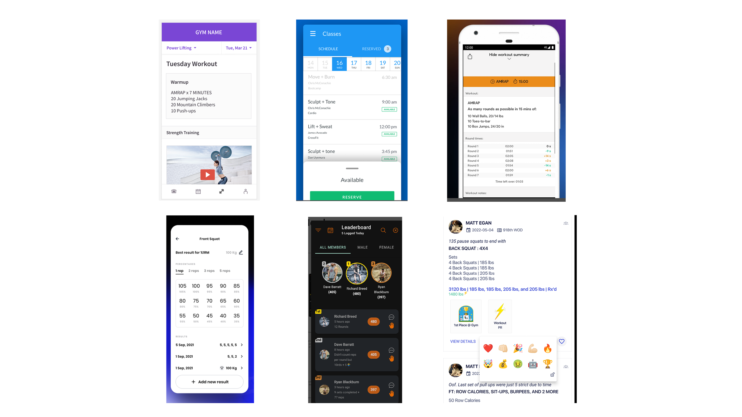
This step allowed me to gain a better understanding of the various fetures and approaches that competitors take. The majority of the apps require a paid subscription and access to a programme to access the features. For this analysis I’ve turned to reviews from users and sales material to preform a quick analysis of features and where we can look to improve.
Key findings:
Stability – Users want a stable app with no downtime
UI – nice and easy to use interface
Features – Useful data without confusing metrics
Social – User like to share achievements
Surveys
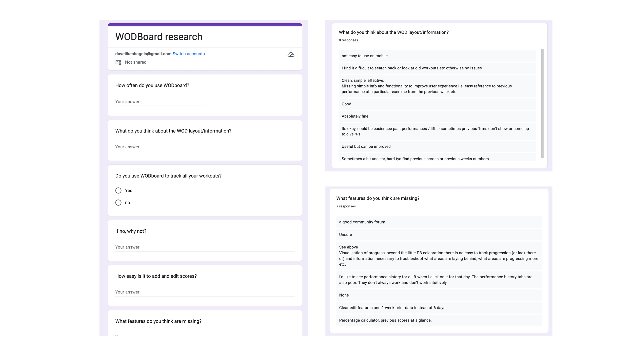
I set up a survey to ask some open ended questions about users experiences with the app and to uncover any pain points they are experiencing.
I managed to recruit 8 people for a small sample to gather some data to create an affinity diagram.
Key findings
Adding and editing scores is a big pain point
Finding relevant previous scores was cumbersome
Percentage calculator missing

Usability test
I asked a couple of users to take in a quick usability study to understand the current flow of adding scores and to uncover any other pain points and frustrations that they might be experiencing.
Key findings
Adding scores was a severe pain point
If you add scores across a workout, you have to go to the last score to be able to add new scores
Workout history difficult to navigate
It was useful to test the app in the environment it would be used. (Trying to remember a score 10 mins after a sweaty workout is surprisingly hard)
Analysis
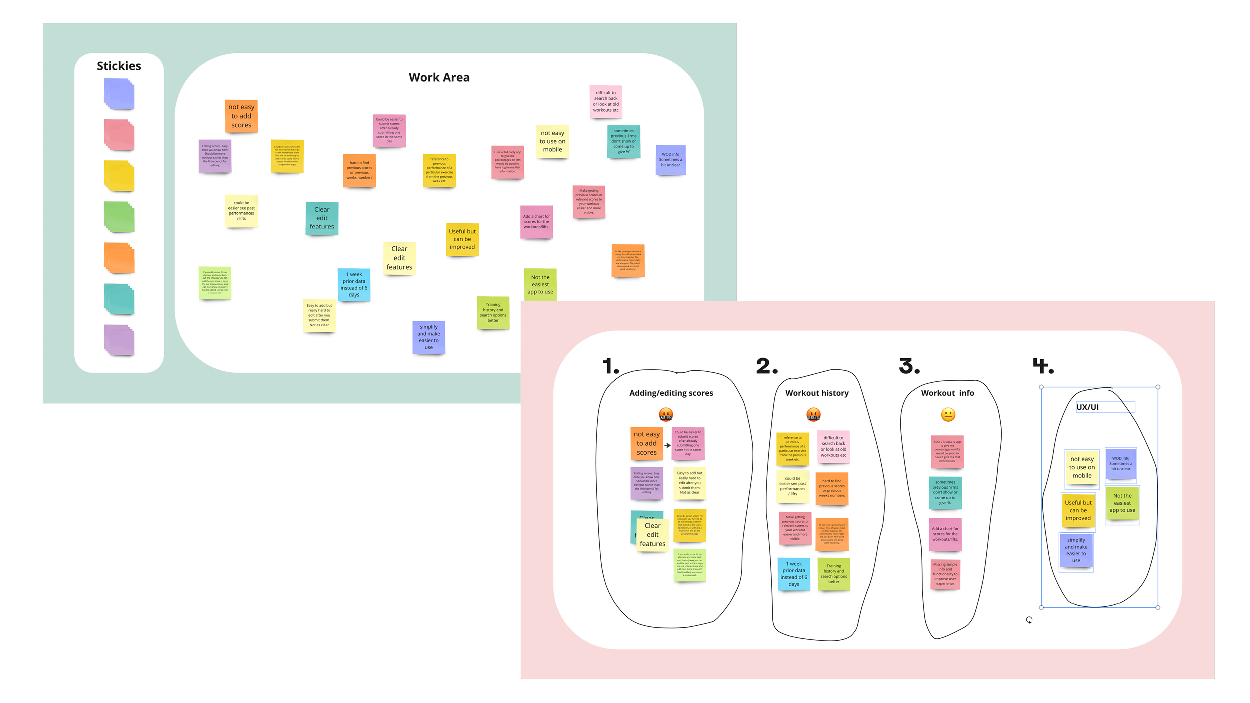
Affinity diagram
Due to constraints I under took this analysis solo.
As I started to review and place my research into notes there were a clear pain points and frustrations for the users.
I grouped the data into the areas and order I would focus on and use this information to help inform a new flow and develop my concept.
Adding and editing scores
Workout history
Workout information
UI and UX (by solving the first 3)
Concept
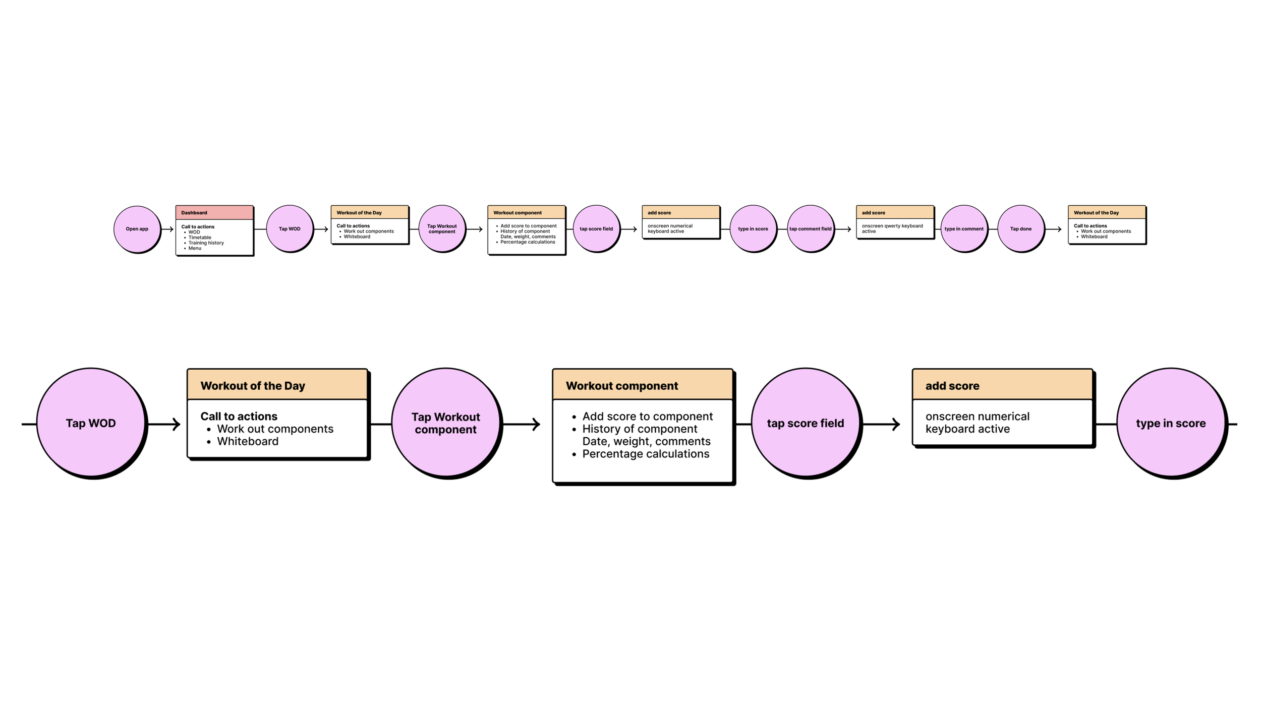
User flow
Using the insights gathered from my research I wanted to make adding scores a simple flow that would allow the user to easily add scores and provide all the desired information that was uncovered in the research.
I believe this flow works well and would eliminate the issues users have with adding/editing scores and provide the other features requested.
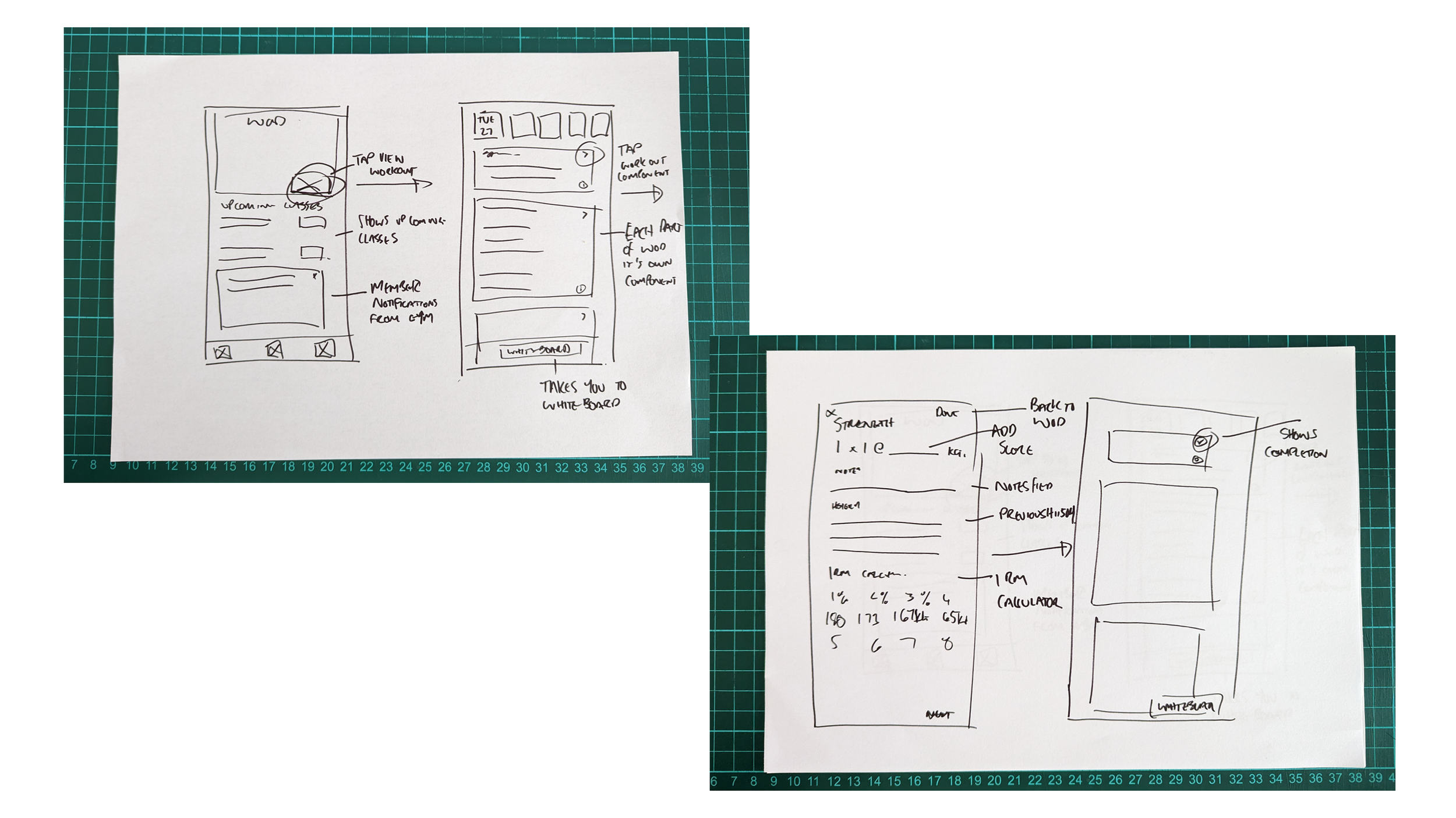
Interaction design
Using the flow, I started to sketch out the new screens based on the insights I had gathered.
During this process I refined the flow based off the interactions of my sketches and arrived at solution that will remove the pain points and add missing features for the user.
Design
Prototype
I decided to skip the wire frame and went straight for a high fidelity prototype.
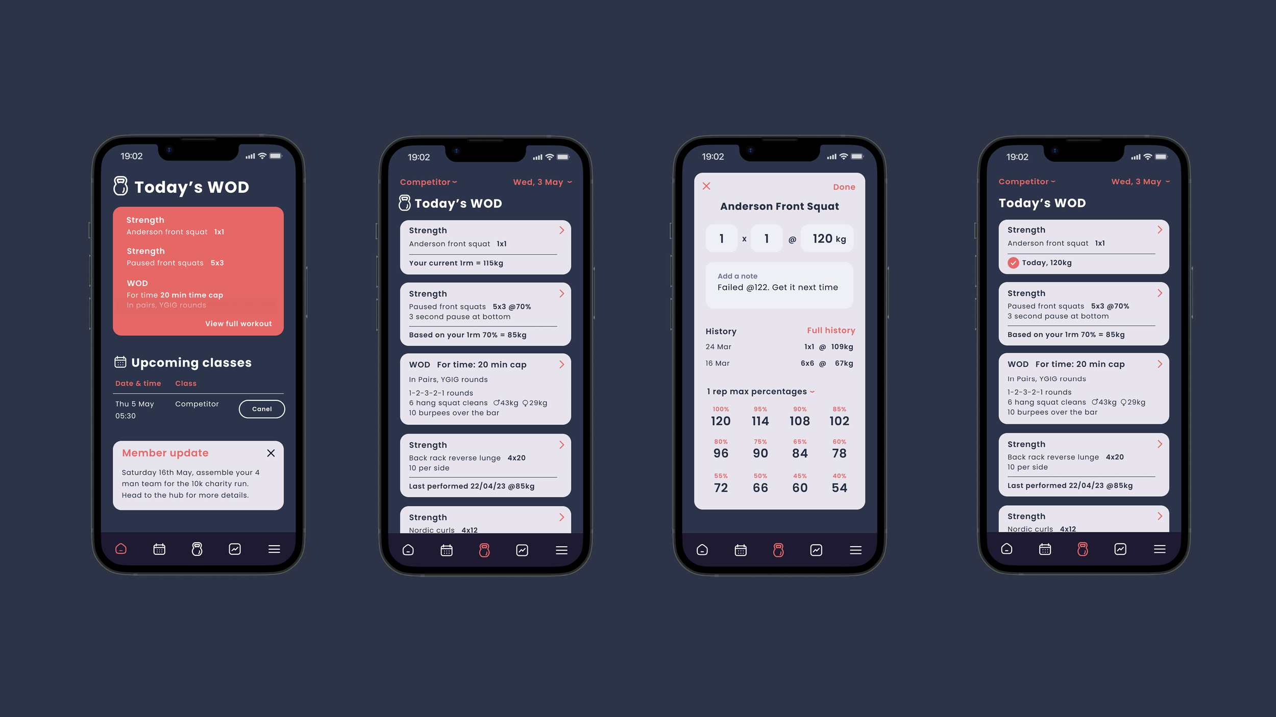
First I redesigned the dashboard, the current design has notifications at the top of the screen, along with a consistency graph. During my usability studies, I found that users didn’t really use this feature.
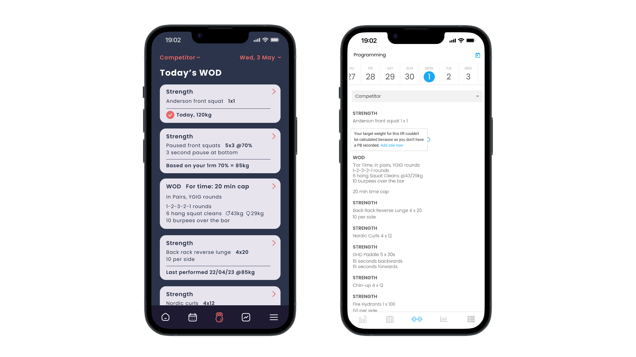
This allowed me to rearrange the dashboard and bring a snippet of Today’s WOD direct to the dashboard and notifications at the bottom would stop movement of these sections.
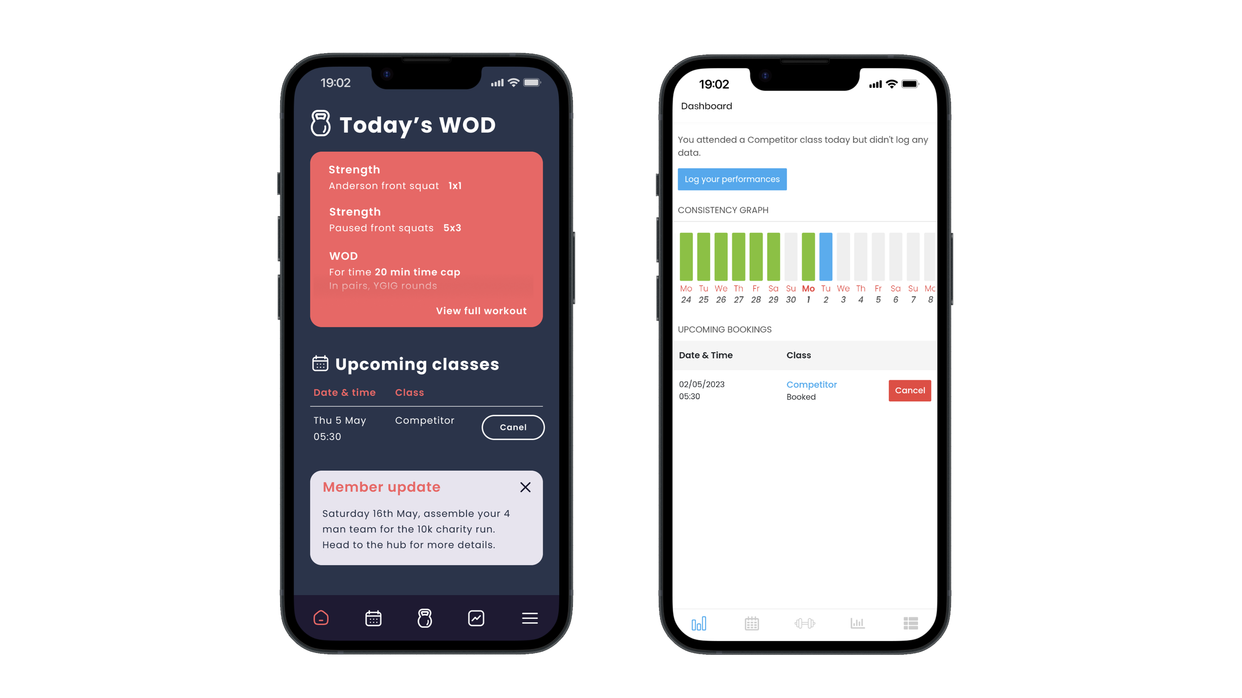
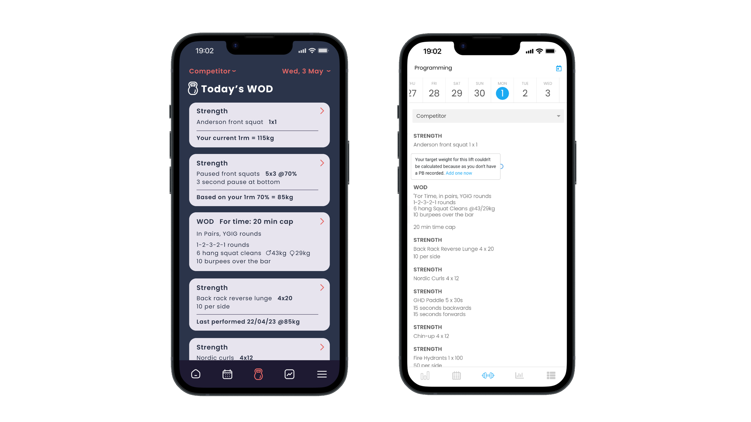
I redesigned the workout into separate cards, this allows for a each component to be actionable and provide relevant information to the user at a glance.
Previous notes and suggested weights are provided without any additional interaction.
Currently the user has 4 different ways to get to the whiteboard to add scores.
My solution would allow adding and editing directly from the workout component, as well as add in useful information for the user. This would reduce user friction and solve several pain points as well as reducing the number of taps required to add 1 score.
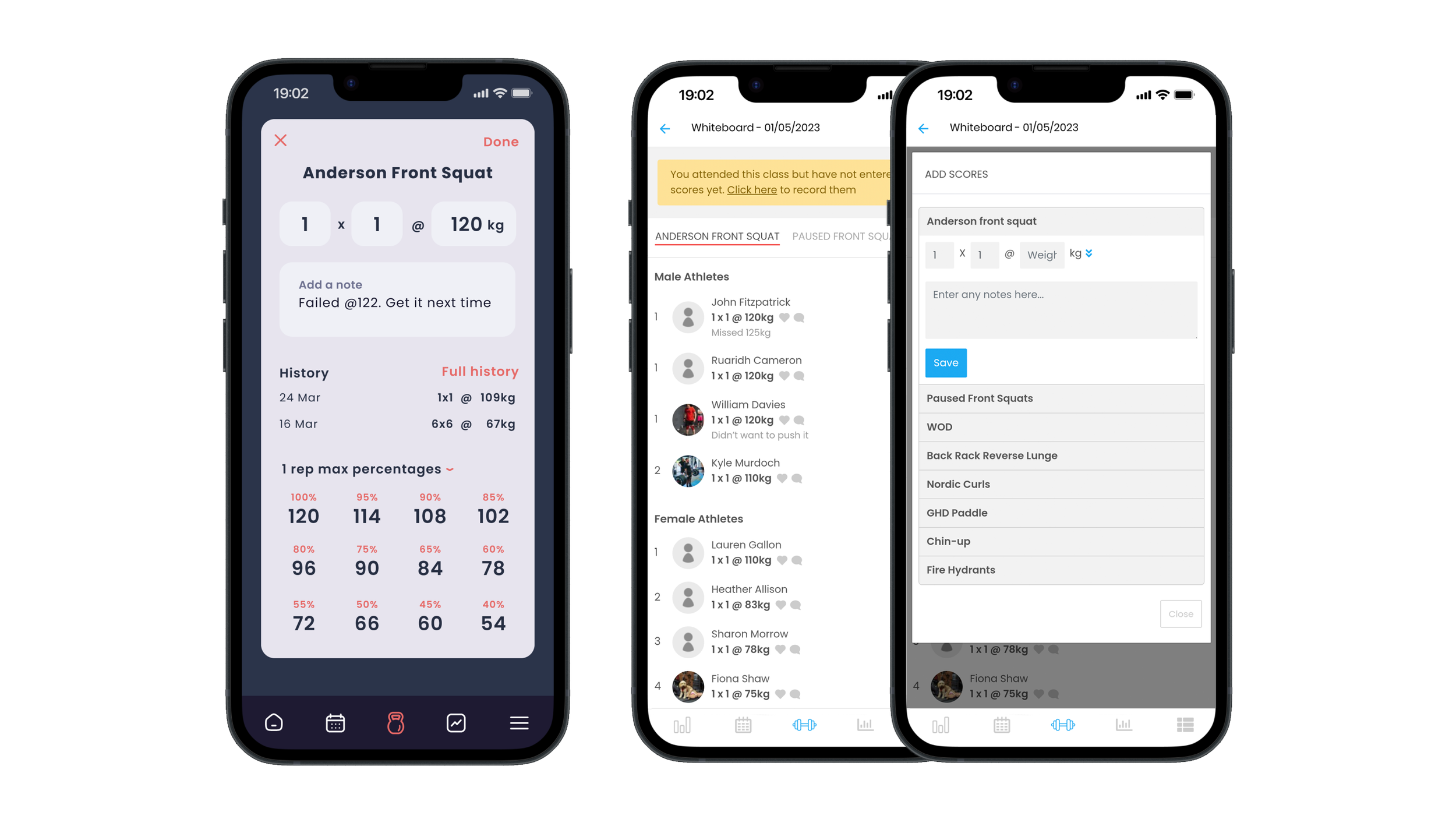
Using the WOD as the main point of interaction for adding scores allows the user to stay focused and get on with their session.
Adding a completion mark allows the user to track what scores have been added or missed over a session.
This redesign would require testing and validation but I believe it would overall improve users experience.